Uber Trip Fare Analysis
Designed an Exploratory Data Analysis (EDA) pipeline to uncover patterns and insights in ride fare data.
Problem
Ride-hailing platforms like Uber generate massive amounts of trip data. However, raw data alone does not provide actionable insights.
From a data science perspective, the challenge is:
- How do trip distance, time, and location affect fare pricing?
- How to detect anomalies such as extremely high or low fares?
- How to understand passenger behavior patterns?
- How to transform messy, real-world data into meaningful insights?
The goal: Extract insights from raw trip data to understand fare trends, demand patterns, and influencing factors.
Solution
To solve this, I performed a structured Exploratory Data Analysis (EDA) pipeline:
- Data Cleaning and Preprocessing: Removed null and missing values, handled invalid coordinates and unrealistic fare values, and converted datetime columns for time-based analysis.
- Feature Engineering: Extracted hour, day, and month from timestamps, estimated trip distance using coordinates, and created variables to better understand ride patterns.
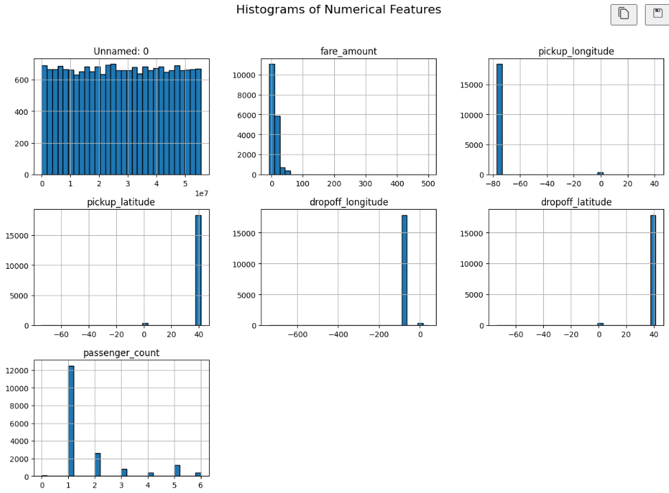
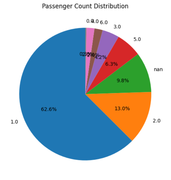
- Univariate Analysis: Analyzed distributions of fare amount and passenger count to detect skewness and outliers in pricing.
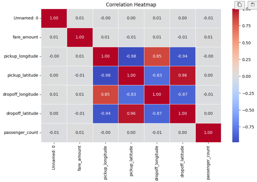
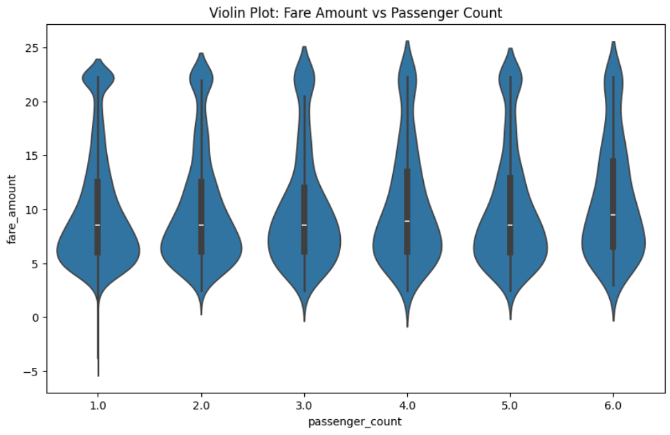
- Bivariate and Multivariate Analysis: Studied relationships between distance and fare, time of day and demand, and passenger count and fare. Used correlation heatmaps to identify key influencing factors.
- Data Visualization: Used line plots for time trends, scatter plots for fare-distance behavior, heatmaps for feature correlation, and histograms for distribution analysis.
- Insight Extraction: Identified peak demand hours, observed pricing patterns based on distance, and highlighted anomalies and outliers.
Challenge
During development, several real-world data challenges were encountered:
- Dirty and Missing Data: Real-world datasets had missing fare values, incorrect coordinates, and inconsistent entries. This required aggressive cleaning to ensure reliability.
- Outliers in Fare Amount: Some rides showed extremely high fares and unrealistically low fares, requiring filtering and statistical handling to avoid misleading insights.
- Feature Relevance: Not all variables contributed equally. Some features had weak correlation with fare and required careful feature selection.
- Data Imbalance and Skewness: Fare distribution was highly skewed and the majority of trips were short-distance, so interpretation had to be normalized.
- Visualization Complexity: The large dataset made trend visualization difficult and prone to clutter, so chart design was optimized for clarity.
Visual Insights
These charts are loaded from your screenshots (image 4 to image 7).
Summary
In summary, I built a complete EDA pipeline for Uber trip data to extract meaningful business and data insights.
The system:
- Cleans and preprocesses raw trip data
- Performs structured exploratory analysis
- Visualizes key patterns and relationships
- Identifies trends, anomalies, and correlations
Key insights:
- Fare is strongly dependent on trip distance
- Peak demand occurs during specific hours of the day
- Outliers significantly affect average pricing
- Passenger count has limited influence on fare
What this project demonstrates:
- Data cleaning techniques
- Exploratory data analysis
- Feature engineering
- Data visualization
Practical data science skills: Handling messy real-world datasets, extracting actionable insights, and communicating findings clearly.